Re-imagining the airport food court
The revamped airport food court was inaugurated in 2022, introducing four new eateries and a completely new aesthetic to the area on Level -1 of the Malta International Airport terminal building. Architecture and design studio I+A spoke to us about the re-design of the area; from choosing materials that evoke a ‘local’ welcoming feel to selecting lighting and insulation for more energy efficiency.
LVC newsletter: What design considerations did you take to create an area that simultaneously serves as a meeting place, a more tranquil place away from the airport hum, and a temporary workspace?
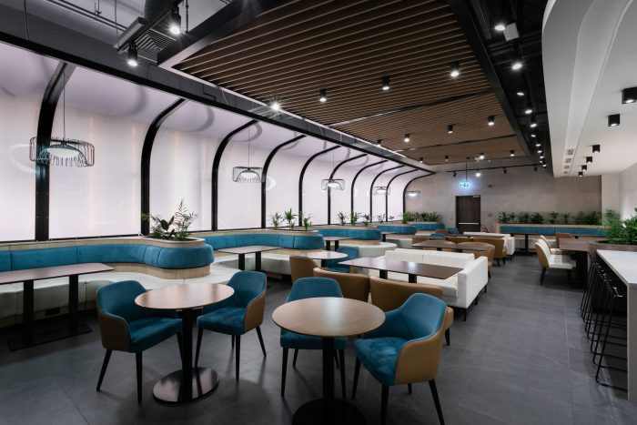
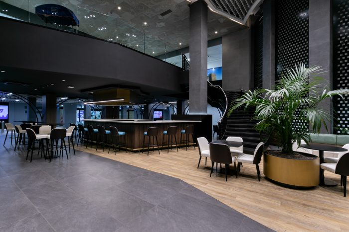
I+A: The design inspiration for the airport food court was to create an “oasis” for travellers: a place where they can pause, take a break, and reflect on their journey. The central bar acts as a focal point where people can grab a drink, relax, and take in the bustling atmosphere. At the same time, the food court provides a tranquil place away from the airport hum. The lounge area at the very end of the food court emits diffused light, through which the peaceful ambiance one would find in a conservatory is recreated. Additionally, the use of custom-made seating has allowed for the space to be segregated into manageable zones without the introduction of walls, creating temporary workspaces for travellers and visitors wishing to catch up on some emails.
LVC newsletter: Were certain elements and materials, such as the steel in the arches and the stone ceilings, deliberately used to create a sense of place? How important are local elements at an international airport?
I+A: We deliberately used elements and materials such as arched entrances, stone ceilings and flagstone patterns to hint at the local culture while maintaining a contemporary aesthetic. The use of local elements is essential in creating a sense of place at an international airport. These elements can also provide a sense of familiarity and comfort for travellers who are away from home.
LVC newsletter: Natural light in the area is very limited. How did you compensate for this through the use of different lighting features and other design elements?
I+A: We compensated for the limited natural light by introducing different lighting features such as the diffused light emitted by the curved wall in the lounge area (pictured in the first photo). We were also able to transform the area’s constraints into design opportunities, creating unique features including the conservatory-like lounge and the double volume.
LVC newsletter: The food court houses six eateries, each one having its unique identity. How did you ensure that these eateries could aesthetically coexist in the same space while retaining their identities?
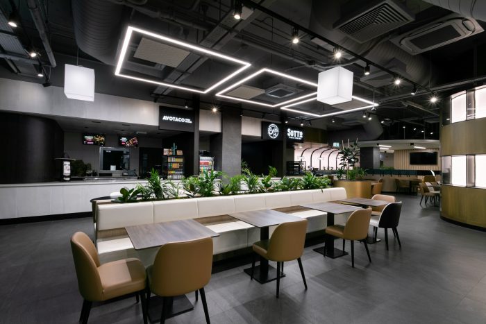
I+A: We ensured that the six eateries could aesthetically coexist in the same space by employing a subtle change in the material palette as one goes further inside the food court. This allowed the different eateries to retain their own brand identities while creating one cohesive experience for guests.
LVC newsletter: Were considerations taken to ensure that the temperature and lighting in the area can be regulated effectively so as to support Malta International Airport in its mission to decarbonise its operation?
I+A: Yes, we considered the effective management of the temperature and lighting in the area to support the airport in this environmental endeavour. For instance, the engineers introduced sensors at user level which, together with a centralised building management system, ensure that fresh air is supplied exactly where and when needed, reducing the resources needed to keep the place running. Insulation was also introduced between the food stalls to ensure that there is no thermal exchange between areas with different temperatures.
LVC newsletter: What would you say was the biggest challenge in designing the area, and how did you turn it into an opportunity to create a unique space?
I+A: The biggest challenge in designing the area was the lack of direct outdoor access, which made it quite a complex engineering challenge from a ventilation point of view. We turned this challenge into an opportunity to create unique features such as the conservatory-like lounge and the double volume. Overall, we aimed to create aesthetically engaging areas that work and are resilient. It was also challenging to design such a large area and avoid making the design too repetitive. Through a continuous palette of materials and colours, our aim was to create a series of interesting features spread across the entire area of the food court. Such features help in keeping the visitor intrigued in all areas while elevating the overall food court experience and providing multiple zones for dining, lounging and catching up on work.
Back to Overview


